Movies
Year in Review: The Best & Worst Posters of 2008
The annual Bloody Disgusting Best & Worst list kicks off with my favorite portion, the best and worst posters of 2008! Beyond the break you can chew on some beautiful one sheets, along with ones that will make your eyes melt (Indiana Jones style). Watch this spot for a new top 10 list from our reviewers every day leading up to the New Year. Feel free to post your thoughts below, or at our forum’s Top 10 of 2008 thread.

Best Posters of 2008
Click any portion of the poster image to see the full one sheet:

Paramount Pictures did an incredible job of building hype around Matt Reeves’ CLOVERFIELD. Shrouded in mystery, the first one sheet featured the Statue of Libery with a missing head, while a trail leads from the destruction into New York City. At the time of release there was no official title, although WRECK, MONSTROUS and a few others were thrown around (and used on variant one sheets at the San Diego Comic Con). Eventually, the studio decided that working title “Cloverfield” had already built in an audience and had name recognition… The main reason this poster is a success is that it delivers exactly what it promises, including a Statue of Libery decapitation followed by the head flinging through the streets of NYC.

While this poster doesn’t really give anything a way from the movie, it does feature a gorgeous set of lips that all males (maybe some females?) wouldn’t mind wrapping their own around. What the one sheet does do is evoke an emotion that the movie delivers on, making it very representational of DEADGIRL – a hip, youth-oriented indie film.

This early teaser one sheet made a debut at the American Film Market in November of 2007 and raised a few eyebrows. The dark underworld image of the chains, blood and guts scream Clive Barker. The poster also gets extra points for delivering exactly what it promises, a hard-edged and violent horror film from the mind of Barker.

While this SAW poster is obviously inspired by one of the characters in Darren Lynn Bousman’s REPO! THE GENETIC OPERA, it’s still really cool and highly representational of the plot of SAW V. Someone is putting on the face of Jigsaw, but who is it? You won’t care by the end, but at least it was fun checking out all of Lionsgate’s promo materials leading up to the release.

At first I absolutely hated this poster, but it eventually grew on me. The image isn’t aimied at us 28-year-olds, its focus is 13-year-old girls. It’s stylish, trippy and screams exactly what little girls relate to – school is hell. The crown falling is representational of the disaster that will unfold and the tagline is highly appropriate for the film: “A Night to Die For”.

While this M. Night Shyamalan movie is about a natural disaster, the movie itself was a disaster, giving this one sheet a double meaning. But in all seriousness, after seeing this poster in theaters I was extremely excited to see the film. I’m a sucker for apocalyptic horror films and seeing the desolte road with flipped over cars struck a cord deep inside me, which I’m sure it did for many others. Too bad the movie sucks…

A monster image of ol’ “Big Red”, what more do you need?

I think this may be my favorite poster of the year as it features a herd of zombies and a camcorder recording the madness. It’s highly representational of the first-person aspect of the film and of the times. It’s one of those posters you’ll look back on in ten years and say, “I remember that one – and all those other voyeur style films.” I also love the artisitc touch in giving the poster video lines, which pretty much always looks cool.


I hate FUNNY GAMES for a few reasons, mainly because director Michael Haneke made the film to insult us horror fans, and to make matters worse remade his own film just to drive that opinion home. But as much as a hate that douche bag, and his sh*t movie, these posters from Warner Independent are freakin’ awesome. They’re stylish, hip and cool; they guarantee a glance while walking throuhg the theater to whatever crap you’re about to see.
Worst Posters of 2008

Besides the fact that the poster just looks crummy, it gives away the f*cking ending of the movie! There are way too many words on the poster, which I guarantee not a single person ever read, and the “rec” image on the right even gets cut off. Furthermore, it doesn’t even look like a horror movie, it looks like a thriller.

While ONE MISSED CALL sucked, it still had a lot of cool imagery that could have made the poster. To see a rendered image of someones face with eyes screaming just looks awkward. It doesn’t even look cool or even well done for that matter. It’s sloppy Photoshop work that’s far from creepy – it’s just plain stupid.

Another Photoshop dud, which makes me want to send an e-mail to all of the publicity departments… USE A REAL IMAGE. Real images from the movie not only look better, but are also representational of what you’re about to see. What the hell does a crappy statue turning to dust have anything to do with the third MUMMY? In addition to the stupid ass image, the background colors are too similar to the statue, making it look like one massive turd.

Had this poster been made back when X-FILES was popular, it wouldn’t be on this list, but it’s been a long, long, long time and the average person had no clue that a new X-FILES movie was coming out. To the average Joe, this poster was just a big X that could stand for X-MEN, “x marks the spot” or countless other things. The fact that they stick Mulder and Scully on the poster the size of a peanut is confusing, and I don’t know a single person who would stop in a theater just to squint and see who they were. This one sheet lacked not only thought and origininality – but logic. Looking at this poster again makes me want to scream “dumbass” to whomever designed it.

This poster completely confuses me on about every single level. First, I didn’t know Kiefer Sutherland could sell a movie, I could have sworn that Alex Aja’s name is more important among horror fans. Second, what the hell is that image? What does it have to do with mirrors? Third, see Photoshop rule, where’s an actual image from the movie? They gave away the jaw-rip scene, why not use it on the poster? This poster is gastly, isn’t it? Fugly….

Jesus, what the hell is this and who the hell approved this poster? The DOOMSDAY one sheet is by far the worst this year. It features a montage of imagery from the film that’s rendered with a one-click Photoshop filter. All Rogue needed to do was take a photo of Rhona Mitra in sexy pleather, rocking a gun and her eye patch and half of America would have been looking. Instead, they squeeze a bunch of crappy images into a logo that means absolutely nothing to anyone. It looks like a hack artist from 8th grade made this poster.
It blows my mind that some of these posters make it into theaters. I do what to give some major props to Lionsgate who takes real time and energy in delivering a solid one sheet that’s not only eye-catcing, but something you’d be proud to throw up on your wall. Lionsgate takes the time to do real photo shoots with an actual goal in the final process. Most of the bad posters appear to feature crappy original art or cheap Photoshop tricks on a boring image. If there was one lesson to be learned, it would be to use REAL photos and stop with all this rendered and artisitc garbage.
Feel free to post your thoughts below, or at our forum’s Top 10 of 2008 thread.
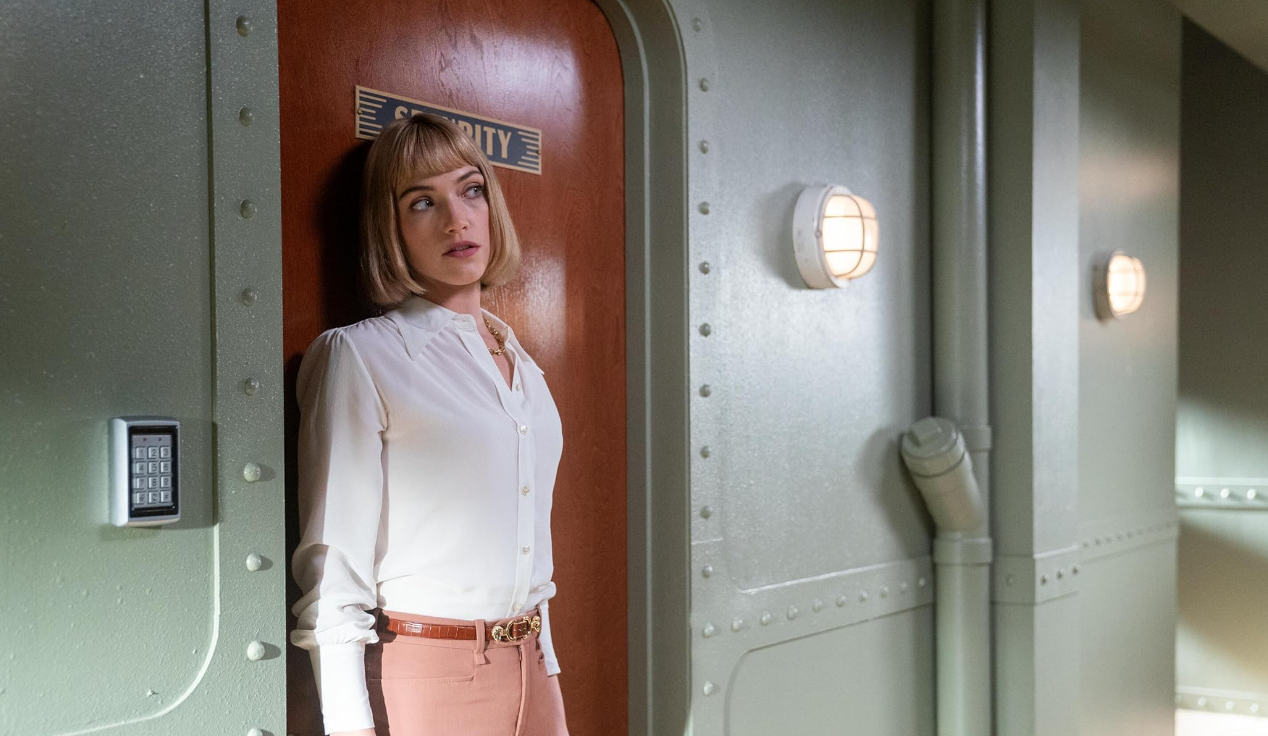
Christopher Landon (Happy Death Day, Freaky) is staying busy here in 2024, directing not only the werewolf movie Big Bad but also an upcoming thriller titled Drop.
The project for Blumhouse and Platinum Dunes is being described as a “fast-paced thriller,” and Deadline reports today that Violett Beane (Truth or Dare) has joined the cast.
Newcomer Jacob Robinson has also signed on to star in the mysterious thriller. Previously announced, Meghann Fahy (“White Lotus”) will be leading the cast.
Landon recently teased on Twitter, “This is my love letter to DePalma.”
Jillian Jacobs and Chris Roach wrote the script.
Michael Bay, Jason Blum, Brad Fuller and Cameron Fuller — “who brought the script in to Platinum Dunes” — are producing the upcoming Drop. Sam Lerner is an executive producer.
THR notes, “The film is a Platinum Dunes and Blumhouse production for Universal.”


4 New Horror Movies Releasing This Week Including ‘Late Night with the Devil’ at Home

‘Ready or Not’: Radio Silence Filmmakers Tease the “Absolute Banger” of a Sequel That’s Taking Shape

‘Sting’ Review – Throwback Creature Feature Entertains With an Impressive Practical Monster

“We Built Every Creature” – ‘Alien: Romulus’ Goes Heavy on the Old School Practical Effects!

‘Terrifier 3’: Filming Has Wrapped on Damien Leone’s Christmas Slasher Sequel!