Comics
[Interview] ‘7 Against Chaos’ Artist Paul Chadwick Talks Cosmic Art & Harlan Ellison

Since the 1980s, Paul Chadwick, detailed, naturalistic style of art has been brought to the public through Marvel’s Dazzler series, his work on Alan Moore’s “Tom Strong” and, most famously, his celebrated series “Concrete”.
In July, Chadwick, along with legendary writer Harlan Ellison and celebrated colorist Ken Steacy, will appear in “7 Against Chaos”. This is a massive one-shot graphic work from DC Comics that defines the term “epic”. So much so that, at times, Chadwick admits to being pushed out of his comfort zone with the story (“Concrete”, beside the basic premise, is not an SF or superhero story. There are no supervillains and, much of the time, “Concrete’s” actions are due to him wanting to please people).
This writer spoke to Chadwick, discussing “7 Against Chaos”, writing dialogue with the man who once wrote “Demon With a Glass Hand” for The Outer Limits, the look of the principle figures, and how many people call Ken Steacy “Kenny.”

BLOODY DISGUSTING: What initially drew you to 7 Against Chaos?
PAUL CHADWICK: Harlan called. He’d sold what was then to be a 4-issue Prestige Format series to DC based on a detailed treatment. It was a stretch for me – I’m not known for cosmic spectacle, which was abundant in the story. But the chance to do something with Harlan, who championed Concrete from the beginning, and helped put it on the map, was irresistible.
Harlan’s always liked me, which kind of puzzles me. Maybe my mild and amiable personality calms him in his ordinarily careening existence. Or maybe it’s that I get his sense of humor and laugh at the right times.
BD: Harlan told me that you helped write the dialogue: “There were places where it was obvious what needed to be said and Paul, using my voice, filled it in.” Could you explain the process?
PC: From the beginning the plan was to work in sort of a maximalist Marvel method – dialogue last. Maximalist in that the treatment was highly detailed. There was no problem in breaking down the story, though I sometimes put in unspecified talking scenes where exposition could come out, just to be safe.
Once I started roughs, Harlan had some new thoughts. He’d set up this future world with a straightforward introduction – the prosperity of the interplanetary civilization, built on the backs of slaves –the “reordered” humans with special abilities and often disfigurements. Also, the (so far) absence of intelligent alien life. But it seemed a little slow (you can see roughs of these pages in the hardcover edition) so we dropped those pages. The gathering of the team amounts to a tour of the solar system, so the reader gets the lay of the land from that.
BD: Harlan’s writing is very distinctive (I once joked with a publisher that, in order to do an anthology tribute to Harlan, cloning would need to be perfected). You, through your work on Concrete and The World Below, also have a very distinctive narrative voice and ear for dialogue. Was it difficult, then, to do this kind of writing (as mentioned previously) when you two are so individual in your styles?
PC: In my analysis, Harlan’s writerly voice is marked by density of information, urgency, compassion, righteous anger, and vivid metaphors and similes. His mastery of word choice, which is one of the things I particularly enjoy about his writing, is induplicable [sic]. But those other qualities I strove to include. Also, the dialogue’s snappy. These aren’t ruminative people-pleasers like Concrete; they’re prickly antiheroes, for the most part.
BD:Your work, from Dazzler (the first comic I ever read, by the by) to Concrete, has a very naturalistic feel–to this writer, it recalls the attention to detail of Kirby and Kubert. What was your approach to doing the vast panorama panels of 7 Against Chaos? (I’m thinking, particularly of the black-hole scenes.)
PC: Attention to detail is everything in art, I think. If only there was unlimited time. I just put in my hours and used the usual bag of tricks – forced perspective, pointing toward the center of interest, lots of overlaps, lots of size differential. I had plenty of practice daubing little white blobs for stars, which I think is crucial iconography for a SF tale. Without starfields, it’s just not right. There are some crowd scenes that really took me to the limits of my patience in this book. Wally Wood fans will notice many of those toplit concentric circular in-and-out doodads on the technology , which I admit is a fetish of mine.
BD: What inspired the character looks–for example Hoorn? How much lee-way did you have as an artist with the narrative?
PC: Well, my priority was pleasing Harlan, so I guess that was my only, and self-made, limitation.
One change I made myself, midway. Ayeleen is a Phoenix, which means she cannot touch another human without building up internal heat that will consume and kill her. So she has a minimal cage around her head so she won’t be accidentally touched. But it started to look like orthodontia headgear to me. So after joining the Seven, it’s replaced with a weak force-field.
Hoorn has one irrationality to his costume. Why would a cat burglar have a voluminous cloak? Well, in part because it makes his acrobatics look dramatic. But it also saves him early from the laser-equipped spy cells, and proves momentarily useful as an anti-pterodactyl device, so I feel it’s semi-justified.
Mourna was visualized to stress her innocence. Ayleen is loosely modeled on Harlan’s wife Susan and her gorgeous cheekbones (and her sarcastic wit). Roark I intentionally gave an unstylish, unmilitary haircut, just to avoid the obvious.
The robot Urr was originally no more anthropomorphic than a piece of carpet-cleaning apparatus. Harlan suggested the art-deco look (he now resembles an Oscar statuette) and, in a last-minute notion, the decorative scratches he’s made like a self-scarring tribesman. It’s a nice expression of his nascent free will.
BD: I was told by Harlan that it was you who suggested Kenny Steacy as colorist. How does he compliment your work and add to the overall gestalt of 7 Against Chaos?
PC: “Kenny” – that makes me smile. I think only Harlan, and maybe Ken’s wife Joan, call him that. But he is a big, enthusiastic kid, in a lot of ways – quite the contrast to my lugubrious presence — so it’s fitting.
Ken’s a great friend who digitally colored a Star Wars book I did for Dark Horse (and has painted, old-school, some great miniseries in his time). He creates beautiful, analogous color schemes. Notice the sequence in the first fifty pages, where we go from planet to planet. You can keep track of where you are by the color scheme. My favorite is the chase on Mars, which, contrary to cliché, is not reddish. It’s beautiful blues and violets.
BD: Ultimately, what do you hope people take away from 7 Against Chaos?
PC: That Harlan, Ken and I really brought it to this book. This has been an embarrassing number of years in the making, but it shows. There’s a lot to it, even though it is just a time-travel adventure story. It’s pulpy, but not self-consciously retro. It revisits Harlan’s familiar themes – betrayed and ill-used misfits doing, reluctantly, the noble thing – trying to save a civilization that barely deserves it. Told with cleverness and heart.
Interview by – Paul Anderson
Paul Anderson is the Acquisitions Editor for Post Mortem Press, edited the acclaimed anthology TORN REALITIES, and acted as creative consultant on the FEAR THE ABYSS anthology. Primarily a short story writer, his work has appeared in numerous anthologies and magazines, including INTO THE DARKNESS, by Necro Publications, NECROTIC TISSUE, STORY TIME AT THE WICKED LIBRARY (audio), and THE NEW BEDLAM PROJECT.


Comics
‘Witchblade’ is Getting Resurrected This Summer in New Comic Series from Top Cow and Image Comics
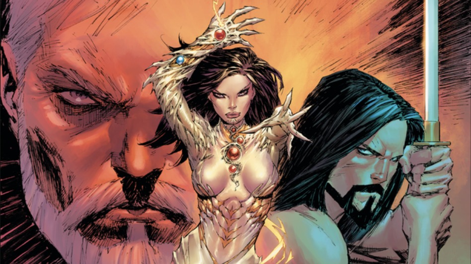
Witchblade, the popular comic series that initially ran from 1995 to 2015 and launched a TV series, is getting resurrected in a new comic series from Top Cow and Image Comics. It’s set to unleash heavy metal, black magic and blood this summer.
Look for the new Witchblade series to launch on July 17, 2024.
In Witchblade #1, “New York City Police Detective Sara Pezzini’s life was forever fractured by her father’s murder. Cold, cunning, and hellbent on revenge, Sara now stalks a vicious criminal cabal beneath the city, where an ancient power collides and transforms her into something wild, magnificent, and beyond her darkest imaginings. How will Sara use this ancient power, or will she be consumed by it?”
The series is penned by NYT Best-Selling writer Marguerite Bennett (Animosity, Batwoman, DC Bombshells) and visualized by artist Giuseppe Cafaro (Suicide Squad, Power Rangers, Red Sonja). The creative duo is working with original co-creator Marc Silvestri, who is the CEO of Top Cow Productions Inc. and one of the founders of Image Comics. They are set to reintroduce the series to Witchblade’s enduring fans with “a reimagined origin with contemporary takes on familiar characters and new story arcs that will hook new readers and rekindle the energy and excitement that fueled the 90’s Image Revolution that shaped generations of top creators.”
Bennett said in a statement, “The ability to tell a ferocious story full of monsters, sexuality, vision, and history was irresistible.” She adds, “Our saga is sleek, vicious, ferocious, and has a lot to say about power in the 21st century and will be the first time that we are stopping the roller coaster to let more people on. I’ve loved Witchblade since I was a child, and there is truly no other heroine like Sara with such an iconic legacy and such a rich, brutal relationship to her own body.”
“The Witchblade universe is being modernized to reflect how Marguerite beautifully explores the extreme sides of Sara through memories, her personal thoughts, like desire and hunger, in her solitude and when she is possessed by the Witchblade. So, I had to visually intersect a noir True Detective-like world with a supernatural, horror world that is a fantastic mix between Berserk and Zodiac,” Cafaro stated.
Marc Silvestri notes, “This is brand new mythology around Sara, and I can’t wait for you to fall in love with her and all the twists and turns. Discover Witchblade reimagined this summer, and join us as we bring all the fun of the 90s to the modern age and see how exciting comics can be. I can’t wait for you to read this new series.”
Witchblade#1 will be available at comic book shops on Wednesday, July 17th, for $4.99 for 48 pages. And it’ll come with multiple cover variants.
-
Cover A: Marc Silvestri and Arif Prianto (Full Color)
-
Cover B: Giuseppe Cafaro and Arif Prianto (Full Color)
-
Cover C: Blank Sketch Cover
-
Cover D (1/10): Dani and Brad Simpson (Full Color)
-
Cover E (1/25): Marc Silvestri and Arif Prianto, Virgin Cover (Full Color)
-
Cover F (1/50): J.Scott Campbell (Full Color)
-
Cover G (1/100): Bill Sienkiewicz. (Full Color)
-
Cover H (1/250): Line art by Marc. Virgin Cover, Inks (B/W)
Witchblade #1 will also be available across many digital platforms, including Amazon Kindle, Apple Books, and Google Play.


4 New Horror Movies Releasing This Week Including ‘Late Night with the Devil’ at Home

Spring 2024 Horror Preview: 12 Horror Movies You Don’t Want to Miss

The ‘Scary Movie’ Spoof Franchise Is Getting a Reboot at Paramount!

‘Ready or Not’: Radio Silence Filmmakers Tease the “Absolute Banger” of a Sequel That’s Taking Shape

“We Built Every Creature” – ‘Alien: Romulus’ Goes Heavy on the Old School Practical Effects!

You must be logged in to post a comment.