Editorials
Best & Worst of 2010: The Year’s Worst One Sheets

The task of selling a film is probably much, much harder than any of us realize, which is why posters meant to stir up excitement for upcoming releases are often so badly calculated. 2010 has been no exception, with a large number of god-awful (or just plain boring) one-sheets cluttering up the lobbies of multiplexes all across the country. Here’s B-D’s list of the worst offenders from the past year.

BEST ONE SHEETS | WORST ONE SHEETS
WORST ONE SHEETS OF 2010
Click any to see it larger
Posters listed in no particular order

Remember the posters from the first few movies? They were hand-drawn, imaginative, museum-quality works of art. As for the remake, I guess this generic one-sheet is the best they could come up with – a sentiment you could also apply to the movie itself. When it comes right down to it, simply throwing up an image of the “new Freddy” and calling it a day is just lazy marketing.

The problem with this poster is pretty simple – we have no idea what kind of movie they’re advertising. Judging by the soft blue light shining from above, this could very well be a tear-jerking drama about a…fucked-up mutant woman with a tail. The film itself was a boundary-pushing horror/sci-fi (albeit an uneven one), and this one-sheet should’ve done a better job at communicating that.

The issue here is the same as with the Nightmare on Elm Street poster – simply showing us an image of the villain is a really weak, uninspired way to sell a movie. Also, the movie is called Predators, plural, right? So where are the rest of them?

What is he firing that gatling-gun at, the ground? And why are they hiding the scarred half of Jonah Hex’s face? This poster is far too generic for the adaptation of a comic-book series known for its imaginative genre-mixing.

From quite possibly the two laziest filmmakers on the planet comes one of the most godawful one-sheets in the history of film advertising. From the looks of it, Fox just farmed this puppy out to a bunch of high school freshmen taking a “Beginning Photoshop” class. Hey, is that someone dressed up as Lady Gaga in the background? A-hardy-har-har!

While the other Piranha one-sheet made our “best-of” list, this one qualifies as one of the year’s worst. Talk about generic – this could’ve been the poster for any number of “killer underwater creature” movies from the last twenty years. Also, the tagline should’ve read “This Summer Fake 3D Shows Its Teeth”, don’t you think?

When you have a winning formula, I guess there’s no reason to mix it up. Still, seeing the same basic image on every single Resident Evil one sheet is getting a little tiresome. Also, I’d like to call for a moratorium on jagged shards of glass representing the 3-D experience on movie posters.

It’s soft-core porn meets Captivity in this awful, lowest-common-denominator one-sheet advertising the upcoming remake of the cult classic 1970 thriller. Pass the cheese.

It’s no wonder Case 39 failed at the box-office. After years of delays and overwhelmingly negative buzz, Paramount couldn’t even be bothered to come up with a decent poster. So what’s it about, exactly? A haunted house? An evil child? Killer luggage? Kinda hard to tell from the pedestrian imagery featured here.

Look, we made $100 million with the first one – do people really give a shit about the poster? Just slap a still from the movie on there like we did with the original! Gosh, this money smells good.

For a cult phenomenon like Hatchet, you’ve gotta give the uninitiated (and those who were only lukewarm on the first movie) a reason to see it. How is it different, etc.? This generic poster is a snooze that could’ve been used to advertise almost any other slasher flick released in the last 30 years.

The sight of Amanda Seyfried walking through a forest just screams “excitement!”, doesn’t it?

Cursed with a premise that’s about ten years too late, this movie follows a group of teens who are forwarded a chain letter (over that new-fangled email) and murdered one by one when they fail to send it along. So I’m just gonna take a guess that in crafting this head-scratching poster, the marketing team at the studio was attempting to hide the fact that the concept of their movie reached “horribly dated” status right around 2005. What other explanation could there be? So there’s a dude wearing pajamas…in chains…lying on top of a barcode…and the tagline is “The Art of Killing”. Ok, I give up.

As if the negative buzz surrounding My Soul to Take wasn’t already bad enough, Rogue had to go and release this incredibly shitty one-sheet to advertise it. Not that I can necessarily blame them – the film’s needlessly complex premise is nearly impossible to sum up in a single image. This poster is the equivalent of the entire marketing team throwing up their hands in frustration.

Here’s an idea: just copy the exploitative poster art used to market the original movie, except render it in B&W so people think it’s more artistic. Then print it. Easy breezy!

Based on this poster, we know the following about The Rite: 1) Academy-Award winner Anthony Hopkins is in it, and his eyes are really blue; 2) the movie has something to do with religion (hence the cross!); and 3) You can only defeat it when you believe (like “evil”, maybe)? Gee, I haven’t been this excited about a slot-filling religious horror movie since Lost Souls dropped back in 2000.

This is premiering on Lifetime, right?


I first heard about The Mandela Catalogue through a couple of nephews who were obsessed with the ARG’s sinister mythology. It was only after watching Wendigoon’s in-depth analysis of the series that I realized just how deep this rabbit hole goes.
In fact, I’d already been exposed to the nightmarish visuals of Alex Kister’s YouTube creation for years at that point without even realizing that it was the origin of several viral “cursed images” and spooky memes that had leaked into the wider internet – with this viral element actually being a part of the Catalogue’s overarching narrative.
Flash-forward to 2026 and the unprecedented success of Kane Parsons’ Backrooms has led to Hollywood betting on horrific internet properties with existing fanbases, which means that Kister’s unique hybrid of both religious and analog horror is finally headed to the big screen with a script written by Kister himself alongside Tyler Clifton.
While this news shouldn’t be too surprising if you’ve been keeping up with the ongoing success of The Mandela Catalogue (both myself and Wendigoon having previously predicted that the series would inevitably make the jump to theaters one day), plenty of horror fans are likely confused as to why so many folks are excited for what appears to be a Hollywood adaptation of a series of creepy .jpeg images under a VHS filter.
With that in mind, today I’d like to invite fellow readers to accompany me as I explore the origins of Alex Kister’s viral hit and attempt to explain exactly why we should all be excited about the Mandela Catalogue adaptation!
From High School Writing Project to Internet Horror Phenomenon

The first seeds of The Mandela Catalogue were sown when Kister was still in high school and developed a writing project subverting religious tropes in a world where biblical history had been altered by demonic forces. A little while later, Kister came across an analog horror contest on Reddit and decided to adapt his ideas into a standalone video where he would edit a religious kids’ cartoon –The Beginner’s Bible: The Nativity, to be specific- into something far creepier. This is how the iconic Overthrone video was born, with this viral short film taking on a life of its own as fans demanded more eerie content from Kister.
Though the video was originally meant to be a one-and-done sort of affair, with Kister actually regretting some of its primitive visuals and considering the editing amateurish and “YouTube-Poop-like” when compared to his current standards, fan reaction and free time during the COVID-19 pandemic encouraged the (then) seventeen-year-old filmmaker to continue producing content set in this same world. The Mandela Catalogue name was inspired by the Mandela Effect conspiracy theory, as the series would slowly begin to explore the subtle horror of alternate histories.
Inspired by existential dread brought on by extended periods of quarantine as well as a personal crisis of faith, Kister continued to expand his alternate timeline where the rise of Christianity had been prevented by what was presumably the Devil disguised as the Archangel Gabriel. This alternate course of fictional events led to the existence of certain paranormal anomalies that had come to be accepted as “normal” by the 1990s, which is why most of the series’ supernatural horror is presented in such a matter-of-fact manner.
Most of this background information and religious lore is delivered by increasingly cryptic broadcasts and in-universe PSAs, as well as the occasional found footage video, that often have to be decoded by clever viewers. Of course, it’s the consistently disturbing imagery that made the series so popular – much of which was originally created by Kister on a smartphone!
The Alternates: Horror’s Most Unsettling Modern Monsters

The show’s early episodes mostly take place within the fictional Mandela County in Wisconsin and depict life in a world where demonic entities are capable of using media to enter our reality. This process usually involves scaring victims into killing themselves and then repurposing their bodies as horrific doppelgangers referred to as “Alternates”. This terrifying phenomenon has become so common that local police already have specialized procedures in place to deal with the issue, though this usually consists of simply ignoring calls for help so as to avoid spreading so-called “Metaphysical Awareness Disorder” any further.
Over time, Kister would expand this mythology and incorporate different kinds of Alternates into the mix, though the story never stopped deconstructing religious concepts. The series’ second volume exponentially increased both video quality and the overall narrative scope as we began to follow the lives of characters who had already grown up in this dystopian hellscape where the government is forced to prohibit religion, television, and even mirrors in the hopes of mitigating the damage done by the ongoing invasion of otherworldly entities.
The really interesting part comes into play when you realize exactly how the Alternates make use of scary media in order to spread their demonic influence, with the analog horror of it all being a diegetic part of the story and something of a memetic trap orchestrated by the false Gabriel.
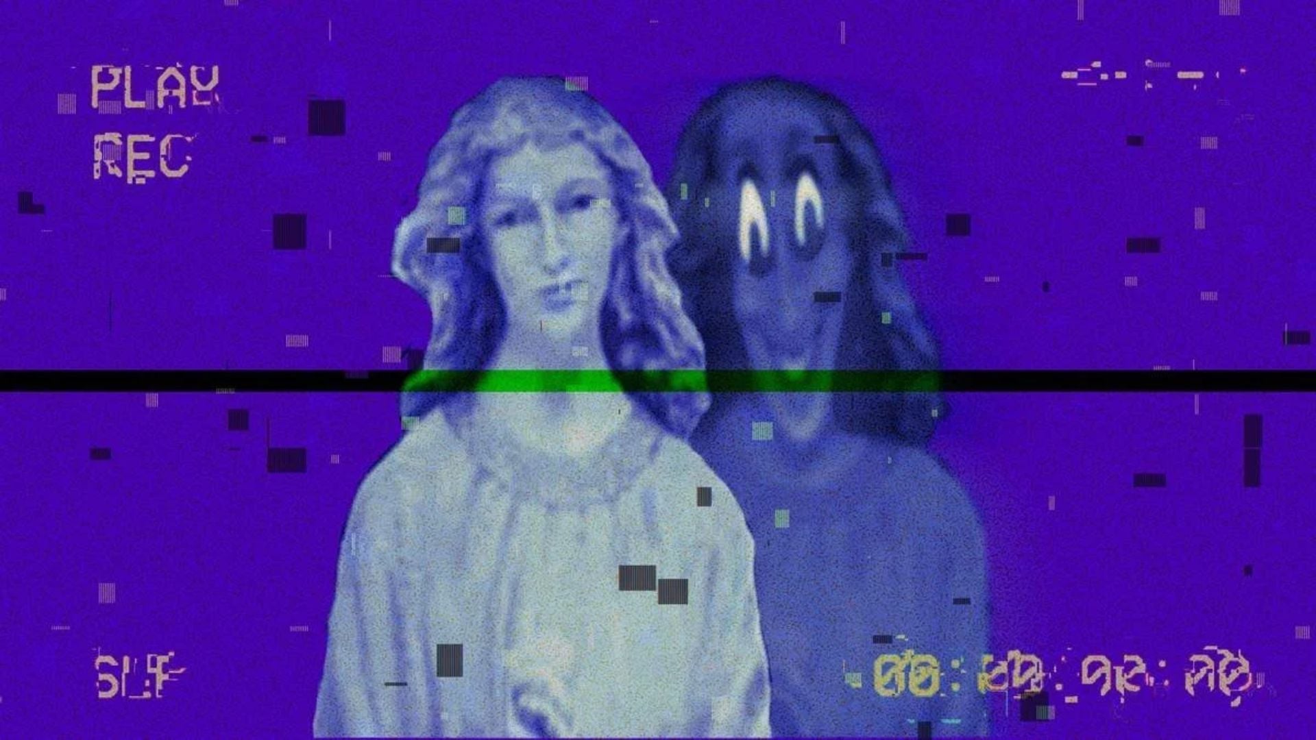
I particularly appreciate how some characters begin to suspect that there’s something wrong with their version of reality and that things weren’t meant to play out this way, especially when Mark utters the haunting line “who have I been praying to all this time?” That’s why I think The Mandela Catalogue is an effective piece of religious horror even if you don’t subscribe to the Christian worldview, as the mere idea of a world where evil has already won is a universally terrifying concept in and of itself. Not only that, but the series’ uncanny analog imagery alone is already worth the price of admission, as you’ve likely already noticed by looking at the pictures accompanying this article.
Why The Feature Adaptation Could Be Horror’s Next Big Success

It’s actually been a whole year since Kister first announced that he had been working on a feature-length screenplay for a Mandela Catalogue movie since 2022, with his proposed story following an ensemble of high-school graduates who uncover a supernatural conspiracy after the mysterious disappearance of a fellow student. This premise sounds similar to narrative elements present in the series’ second volume, but I’m pretty sure that Kister is going to go the Kane Parsons route and make the movie more of a spin-off than a re-imagining of its source material.
While notable Hollywood producers like Aaron B. Koontz, Scott Stuber, and Steven Spielberg himself are backing the upcoming project, I feel like there’s no one better to adapt this deeply personal exploration of faith and the dark side of communication than the person who first came up with it. That’s why I can’t wait to see Kister’s work on the big screen, as I have a feeling that this young filmmaker is the next one on the list about to make cinematic history – especially since this is clearly a passion project that has been in the works for years at this point!
That being said, there’s always a chance that the film could end up unleashing a fresh wave of Alternate incursions, but I guess that’s just a risk we’ll have to take.
You must be logged in to post a comment.