Comics
Best Comic Covers Of 2011: KtMc’s List

As Lonmonster said below, we’ve been told a million times not to judge a book by its cover. Well, I disagree too; how else are you supposed to be introduced to books with mainly illustrations? The cover art of a print novel doesn’t always matter, because what’s inside is all writing; you’re not directed through the story by images. The cover art of a comic, however, is essentially its central image. The first impression, if you will. The cover is what first draws you in, and it all depends on who you are and what you like. It’s up to the inside to entice you to stay awhile, but that’s another article entirely. Compiled below are some of the most badass covers of 2011.
Whether they were gory, classic, funny, eccentric, or all of the above, there have been some great comics released this year. All of the titles presented above did have cool covers, but in the end, the comics inside are what won our hearts. Don’t judge a book by its cover – judge the cover and the book.

KtMc’S TOP 10 OF 2011

The hero comics have really been pulling out all the stops this year with some epic new arcs (cough, Snyder, cough) and equally brilliant artwork. The cover of Green Lantern #1 particularly jumped out at me, as it plays into the oath perfectly by contrasting the intense green light with the dark, stormy background. The tightly clutched fist splattered in blood shows Green Lantern’s struggles to achieve victory, making it a strong expression of the true meaning of heroism.

There are so many things going on in this cover, which may lead some readers to believe it to be too busy. Lies! “Busy,” in art, implies an overwhelming feeling – a feeling of chaos. All of the elements in this cover link seamlessly with the gears around the edges, creating the effect of unlocking the gate.

I have never seen Superman in an “Oh, shit” moment as awesome as this one. Usually, Clark’s either exuding a planet of confidence, or he’s entirely dark and brooding. Action Comics #3’s cover captures Superman in a new light. With his tense neck and awkward hand positioning, he looks more down-to-earth, which would also explain the protestors.

I’m a bit of a sucker for body parts. That sounded less dirty in my head, but I’m keeping it. Seriously, though, the Ferals cover really did some justice to the art of dismemberment. I was especially drawn to the way that all of the half-naked bodies seem connected. Combined with the fantastic shade of red (just a slight dullness to it…tasteful vibrance), it’s like a blood orgy below this huge, prehistoric-looking canine with a look of ominous satisfaction plastered across its mug.

So, I’ve been obsessed with Witch Doctor since day 1. Dr. Morrow is the Dr. House of comics, and the artwork keeps up with the story tremendously. He’s definitely got the most expressive eyes, which is why I had to put a Witch Doctor cover on the list. They’re all consistently bizarre and awesome, but Morrow’s best feature is displayed perfectly here. For real, next time you pick up an issue, take a look at those peepers.

Every week, I find that one cover that makes me stop and go, “Waaait… did I really just see that?” Pretty much every Butcher Baker cover holds that theme, but Issue #3 just screamed “WTF?” The blinding white light blended into various shades of turquoise (not to mention the purples… the purple boobies are a nice touch) brings out the loud, fantastic adventure that Butcher Baker is.

Braaaaaaains… with a side of eyes and tongue, if you please. Night of the Living Dead’s cover captured the soul of the original film perfectly. The line work here is stunning, capturing every gory detail. The gore is probably too much for some, but the extreme is what makes it perfect, in this case. This proves that the concepts of traditional gore still grip at our hearts and stir our consciences.

Has Hellraiser busted through the chains this year, or what? Issue #5’s cover immediately brought me back to the first time I saw the original Hellraiser film, and how it was so perfectly portrayed. The new comic series has allowed Hellraiser to evolve into what it was meant to be, and a cover showing the hellbound hearts at their starting positions could not have been more perfect for the start of the new arc.

I first saw this cover in the door of a comic book store in my area. I jumped, but then I proceeded with giddy female excitement. This cover is the most brilliant use of a predominately black palette that I’ve ever seen. There’s just enough shading near the middle to capture the absolute perfection of Venom as a character. It makes all the difference when the image actually projects out of the background without the alienating 3D glasses.

When I first saw this issue in person, I had to meticulously inspect it to make sure it was actually drawn. It looks like someone snapped a picture of Doug Bradley attempting to watch Revelations. The precision of the lines here is perfect; the image of the Head Cenobite pops off the page, out of the issue, and into your mind. Every emotion is captured perfectly, the contrasting shadows (light on the top, dark on the bottom) are well-illustrated, and the pins poking through Pinhead’s (sigh… alas, he remains nameless) hand act as a fantastic small detail. I am definitely looking forward to what Hellraiser has in store for 2012; Clive Barker is sure to deliver more incredible tales of the Cenobites, and hopefully a name for our dear leader.



Comics
‘Curse of the Where Wolf’ Bites Into August Release With Trio of Werewolf Theatrical Screenings [Exclusive Preview]

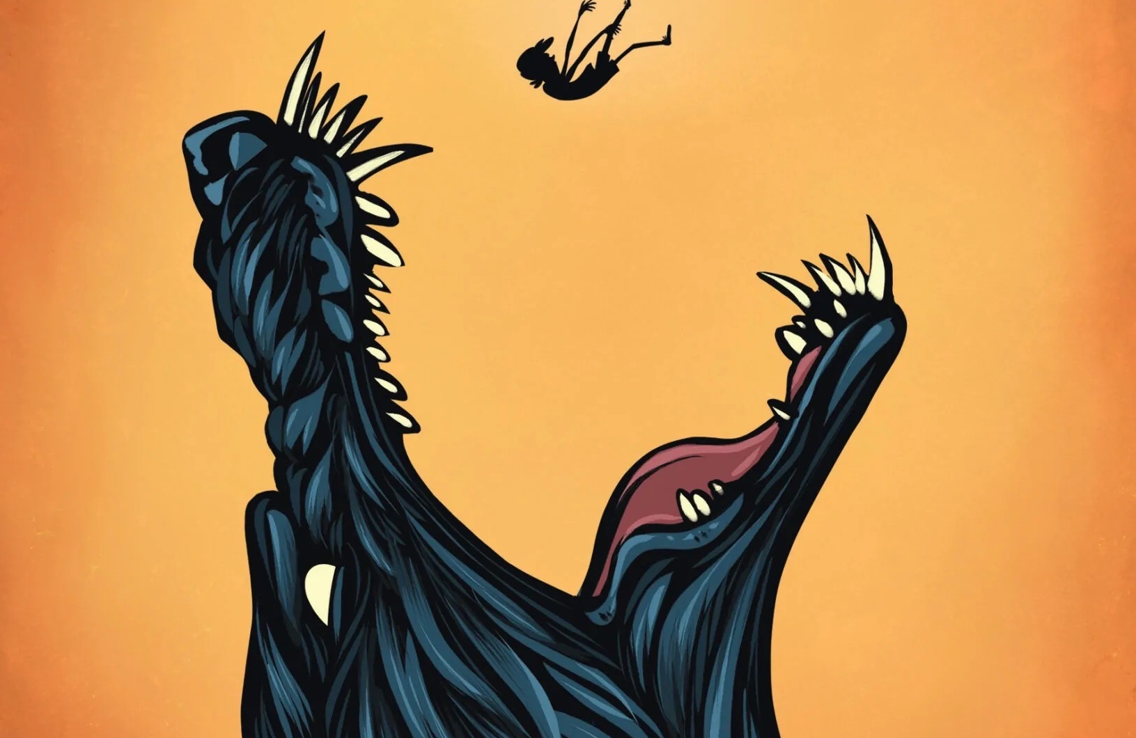
Larry Chaney‘s hairy misadventures are continuing in the sequel graphic novel Curse of the Where Wolf from creative team Rob Saucedo, Debora Lancianese, and Jack Morelli, and its author is celebrating with a trio of horror’s greatest werewolf films.
The Curse of the Where Wolf hits shelves on August 7 from Encyclopocalypse Publications.
That coincides with the launch of a theatrical screening event in Houston, Texas, featuring a trio of seminal werewolf flicks turning 45 this year: The Howling on August 7, Wolfen on August 14, and An American Werewolf in London on August 21.
Each screening features a “werewolf in film” presentation as well as a book signing from Where Wolf author and River Oaks Theatre artistic director Rob Saucedo.
In the new graphic novel, “Being a werewolf sucks. Reporter Larry Chaney wanted to be a hero. Instead, he became a werewolf. Now, caught between incredible new powers and a desire to eat everything (and everyone) in sight, Larry must find a cure for his curse. Or die trying.”
“With Where Wolf, I wanted to tell a whodunit set in a furry convention, so the story was pretty contained within a very specific setting and genre. With Curse of the Where Wolf, I wanted to celebrate everything I love about the possibility of comic books. Curse of the Where Wolf is a funny book, in every sense of the phrase, but it’s also an earnest look at a person’s struggle to become a better version of themselves, especially when the alternative is to become a literal monster,” Saucedo says of Curse.
The original graphic novel was previously serialized as the first webcomic hosted on Fangoria before being collected by Encyclopocalypse Publications in 2023 and has already been optioned for film, podcast, and television development ahead of launch by producers James Fino (“The Freak Brothers” for Tubi, “Rick and Morty” for Adult Swim) and Charles Horak (First Date for Magnolia Pictures).
Expect Larry to find himself in even weirder situations in the 362-page full color sequel; Saucedo has provided Bloody Disgusting with exclusive art pages from the upcoming graphic novel that showcase lupine humor.


You must be logged in to post a comment.